If you have ever approved artwork for lanyards, cards or event materials and then wondered why the printed colour looked slightly off, this is usually where the PMS versus CMYK question starts. What is the difference between PMS and CMYK? In practical terms, PMS is built for colour accuracy and consistency, while CMYK is built for producing full-colour images by mixing inks.
That distinction matters when your brand colour cannot drift. For schools, corporate teams, event organisers and procurement staff, even a small shift in shade can make branded items look mismatched across different products. If you are ordering lanyards, wristbands, PVC cards or promotional print, knowing which system suits the job can save time, rework and frustration.
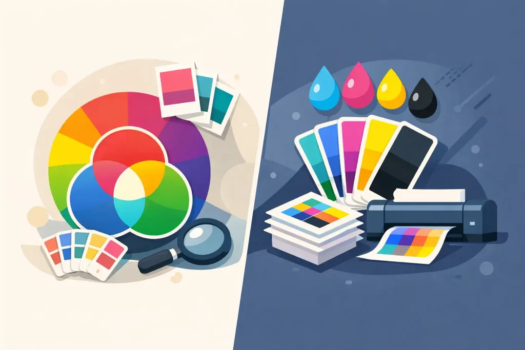
What is the difference between PMS and CMYK in printing?
PMS stands for Pantone Matching System. It uses pre-mixed spot colours, each identified by a specific Pantone reference. Instead of combining four inks during printing to approximate a colour, the printer uses a dedicated ink that has already been mixed to that exact shade.
CMYK stands for cyan, magenta, yellow and key black. It creates colours by layering percentages of those four inks. This is the standard process for most full-colour printing, especially where artwork includes gradients, photos or complex multi-colour graphics.
So the short answer to what is the difference between PMS and CMYK is this: PMS prints an exact, pre-mixed colour, while CMYK simulates colours by combining four process inks.
Why PMS is usually better for brand-critical colours
If your organisation has a strict style guide, PMS is normally the safer option. A Pantone colour is a fixed reference, which gives you a much stronger chance of matching your branding consistently across repeat orders and different product types.
That is particularly useful for items such as custom lanyards, access control products and ID accessories, where a solid corporate colour often does most of the visual work. If your logo blue, green or red needs to look the same from one order to the next, PMS gives production a clear target.
It also reduces the guesswork for non-designers. Marketing teams may already know their Pantone references, but office administrators, school staff and event coordinators often just know they need the item to match previous stock. In those cases, spot colour printing simplifies the conversation.
At Lotsa Lanyards, being able to print in any PMS colour at no extra charge is a practical advantage for buyers who need brand control without adding cost pressure. That matters when you are ordering in volume and trying to balance budget, speed and presentation.
Where CMYK makes more sense
CMYK is not the lesser option. It is simply designed for a different job.
If your artwork includes a photograph, a multi-colour illustration, tonal shading or a gradient, CMYK is often the right method. It can reproduce a wide range of colours within one print run without requiring a separate mixed ink for each shade. That makes it efficient for complex artwork.
For example, if you are producing promotional cards with a full-colour background image, or event collateral that uses several colours in one design, CMYK may be the most practical and cost-effective choice. It is flexible, widely used and ideal for designs that would be inefficient to build with spot inks.
The trade-off is accuracy. CMYK can get very close to many colours, but not every PMS shade can be matched perfectly in process print. Some vibrant oranges, greens, blues and metallic-looking tones are difficult or impossible to reproduce exactly with CMYK.
The real issue: consistency versus flexibility
Most buyers are not choosing between PMS and CMYK based on printing theory. They are choosing based on what needs to stay consistent and what can be visually close enough.
If the key requirement is exact brand matching, PMS usually wins. If the key requirement is reproducing detailed full-colour artwork, CMYK is usually the better fit.
This becomes more important when your branded materials are ordered across multiple categories. A lanyard, card holder insert, staff pass and wristband all sit next to each other at an event. If one item is printed in a close-enough blue and another is printed in your exact brand blue, the mismatch is obvious.
That is why procurement and marketing teams often prefer PMS for simple logos and solid-brand applications, even when CMYK would appear cheaper on paper. The cost of inconsistency can be higher than the saving.
What is the difference between PMS and CMYK for lanyards?
For lanyards, PMS is often the stronger choice because lanyard artwork is usually simple and brand-led. Most designs rely on a background colour, a logo and maybe a line of text. In that format, spot colour printing gives cleaner control over the core brand shade.
CMYK can still work for lanyards, especially if the design includes gradients, photographic effects or multiple tonal changes. But if the goal is a precise navy, a specific maroon, or a recognisable corporate green, PMS generally delivers a more dependable result.
This is one of those jobs where the intended use matters. A conference giveaway lanyard with flexible branding may suit CMYK. A university, school or corporate ID lanyard that needs to align with existing visual identity standards will often benefit from PMS.
Why printed colours can still vary
Even with the right colour system, printed results are affected by the material, print method and finish.
Ink behaves differently on polyester lanyards than it does on coated card stock or PVC. Surface texture, fabric weave, gloss level and production method all influence how a colour appears. A Pantone-matched ink improves control, but it does not make every substrate behave identically.
This is where pre-production support matters. A supplier that checks artwork carefully, recommends the right print method and provides samples where needed will help avoid the classic problem of approving a design on screen and expecting the finished product to look identical in real life.
For deadline-driven orders, that support is not a nice extra. It is part of getting the job right the first time.
How to choose between PMS and CMYK
The simplest way to decide is to start with the artwork and the role the colour plays.
If your design uses one or two solid brand colours and those colours need to match other branded items, choose PMS. If your design includes photos, gradients or several blended colours, choose CMYK.
If you are still unsure, ask one practical question: will anyone notice if the colour is slightly different from our brand guide? If the answer is yes, PMS is the safer path. If the answer is no, and the design needs image detail or tonal range, CMYK is often perfectly suitable.
There is also a middle ground. Some jobs use a combination approach, with PMS for a critical brand colour and CMYK for the rest of the artwork. Whether that is possible depends on the product, print process and budget, but it can be worth discussing when colour accuracy matters in one area more than another.
Common mistakes buyers make
One common mistake is assuming screen colours are final print colours. They are not. Digital screens display RGB light, which has a different colour range from print.
Another is sending a logo file with no Pantone reference and expecting an exact match. If the brand colour matters, the Pantone code should be supplied wherever possible.
The third is choosing CMYK for a brand-critical job simply because it sounds standard. Standard does not always mean suitable. The right method depends on the result you need, not the shortcut.
The best option depends on the job
There is no universal winner in the PMS versus CMYK question. PMS is stronger for exact colour matching, repeatability and solid brand presentation. CMYK is stronger for full-colour artwork, photos and designs with more visual complexity.
For most organisations ordering branded accessories, the decision comes down to one thing: is this item meant to match our brand precisely, or just represent it well enough? Once that is clear, the print method usually becomes clear as well.
If you are ordering products that people wear, carry or use at events, colour choices are not a small detail. They shape how consistent, professional and prepared your brand looks. Getting that part right upfront makes the whole order easier.